Previous drafts of Florida’s vaccine analysis tell a very different story
You may recall Florida’s vaccine analysis released last October which claimed that mRNA vaccines are associated with increased risk of cardiac death in young men.
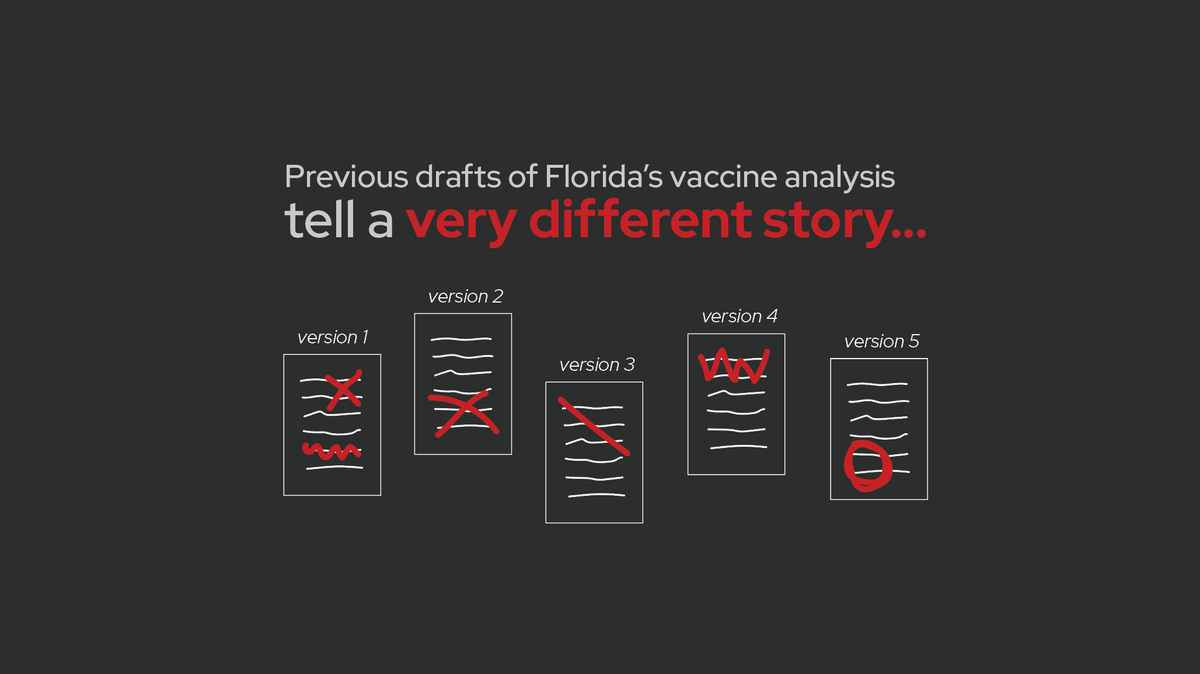
This week, the Tampa Bay Times shared earlier, unpublished drafts of that analysis.
Those earlier drafts tell a dramatically different story…
The Tampa Bay Times obtained 5 previous drafts of the analysis from an anonymous source. These drafts show very different results and/or conclusions compared to the final version of the report released last October. (For a quick rundown of the original report, see this post.)
Now, to the drafts. (I am calling them version 1-5 based on the order provided in the Tampa Bay Times article, which also seems to be the likely order the drafts were created.)
Version 1: completely opposite results
Version #1 of the report is the most distinct from all the others. The time periods used for “risk” vs “control” periods are different. Some of the age subgroups are different.
And most importantly, no increased risk of death was detected in any age/vaccine group.
Basically, version 1 reported the exact opposite results as the final, publicly-shared version. It showed no association between vaccination and increased risk of death, and for some subgroups, vaccines were associated with reduced risk of death.
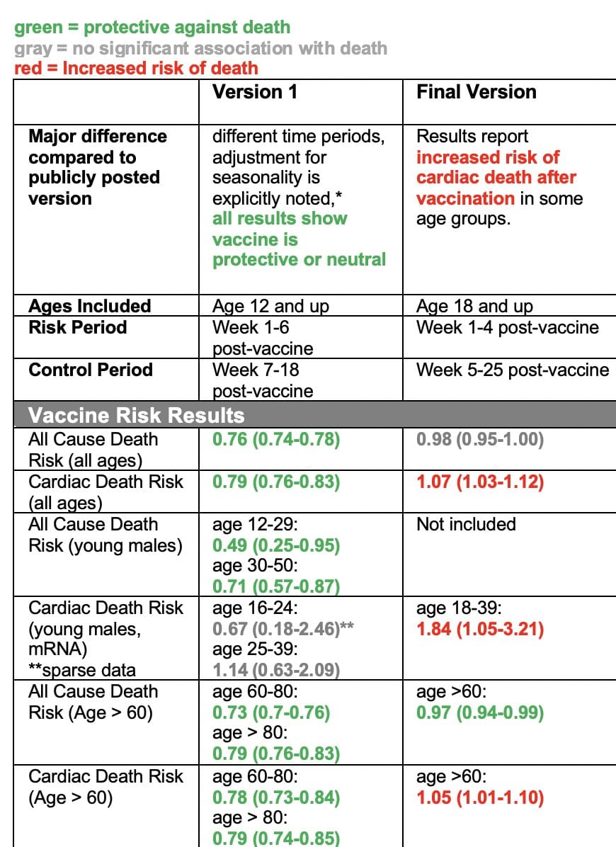
The table below summarizes the key results from each version. If you’re not familiar with interpreting this type of data, then just look at the colors: green are results showing vaccination is associated with reduced risk of death, red means vaccination is associated with increased risk of death, and gray means there was no association either way.
In version 1, you see ALL GREEN AND GRAY — none of the results, for any of the ages or subgroups analyzed showed any association with increased risk of death after vaccination. But in the version that was released in October, many of those results changed. Now there was a lot of red.
What did they change?
What specifically did they change between version 1 and subsequent versions?
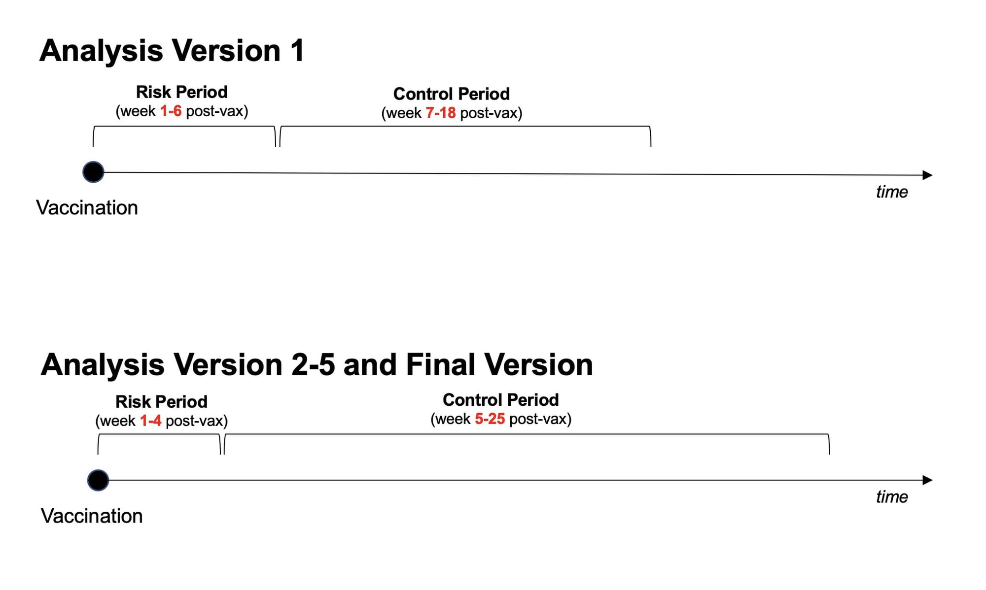
In all versions (including version 1), the study design they use analyzed how many deaths occurred shortly after vaccination (risk period) versus a control period afterwards. In version 1, the risk period was week 1-6 after vaccination, and the control period was week 7-18 after vaccination. In subsequent versions, the risk period was week 1-4 post-vaccine, and the control period was week 5-25 after vaccination. Some of the age subgroups are also different.
So which of these study designs is “right?”
From the information we have, it’s hard to say. Sometimes there are clear reasons why you should pick a certain subgroup or risk period. Other times researchers pick a reasonable cut off and just go with it.
However, knowing the results from both designs, we do have reason to be concerned.
The fact that this slight change in study design yielded opposite results suggests the results aren’t particularly reliable. If you tweak your design parameters slightly, without a clear hypothesis-driven reason to do so, and the whole thing falls apart, that suggests your results may not be real but rather are just statistical noise.
P-hacking: chasing significant results
While we don’t know the rationale behind these changes, one possible explanation for this pattern of results is p-hacking.
P-hacking basically means “chasing statistically significant results.” It occurs when people slightly change and tweak analysis parameters, reanalyze the data, slicing and dicing it different ways until they find a significant result they want or expect.
Often times, p-hacking happens without researchers fully realizing they’re doing it. They have a hypothesis, they pick a study design, but they get results they don’t expect. Instead of stopping there, they think “well maybe if I just analyze it this way…” and end up doing a bunch of different “tweaks”, finally finding one that yields the result they expect.
But if they find a “statistically significant” result, doesn’t that mean it’s real?
No.
Significant p-values can and do occur by chance. If you run enough versions of the analyses, you’re bound to find significant results eventually, even with no real effect in the data.
A significant result doesn’t necessarily mean the result is “real.” It means the distribution of the underlying data has met a certain statistical threshold, which may due to a real effect, confounding, or statistical noise. (This is why it’s important to reproduce experiments and see if you get the same result multiple times from different data sets — when it’s real, you can reproduce it.)
Again, without more information on the reason behind the changes made between versions 1 and 2, we can’t say if this is p-hacking. Sometimes there are valid reasons for changing study design.
That being said, the fact that this subtle change in study design yields opposite results is concerning in itself. It suggest the results are not reliable, and the increase in cardiac death after vaccination may just be statistical noise.
Version #2: What about COVID?
One of the major criticisms back in October when the Florida analysis came out was the analysis failed to look at the risk of COVID infection and balance that with any risk of vaccination.
It turns out, they did run that analysis — they just didn’t include it in their report.
In version #2, in addition to looking at risk of death after vaccination, they also look at risk of death after COVID infection. They find the risk of death after infection is way higher than risk after vaccination, for all age groups (even young men).
The same pattern held true when they looked at cardiac-related deaths (it should be noted that the way they defined “cardiac-related” was not great, and has its own set of issues). According to their analysis, the risk of cardiac-related death in young men after COVID infection was folds higher than after mRNA vaccination. Below is the data from version 2 for the risk to young men. (When interpreting odds ratios (OR), a number more than 1 means increased risk and a number less than 1 means decreased risk.)
mRNA vaccine:
- men, age 18-39: OR = 1.84
COVID infection:
- men, age 18-24: OR = 23.62
- men, age 25-39: OR = 15.39
According to their own analysis, the odds ratio for risk of cardiac-related death in young men after COVID infection is way higher than the risk after mRNA vaccination.
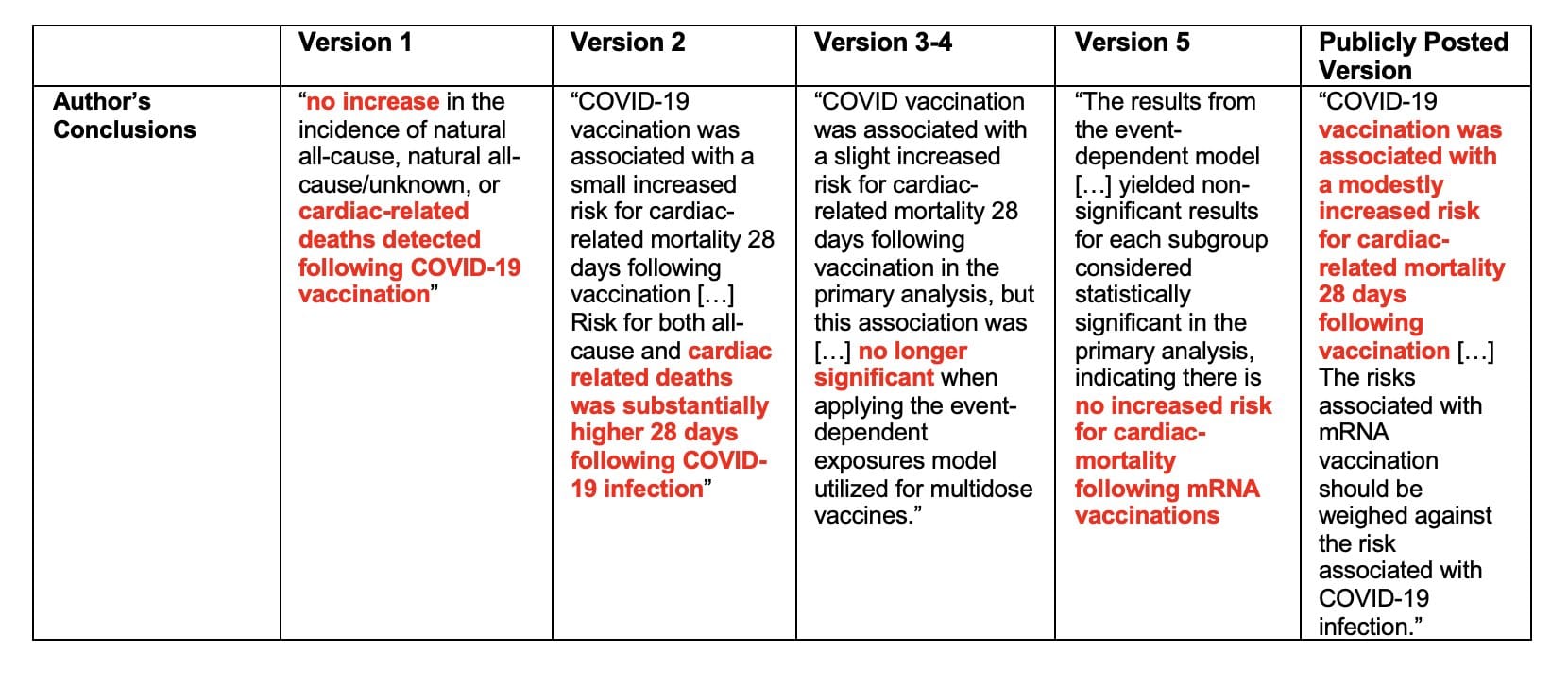
In version 2, authors conclude “COVID-19 vaccination was associated with a small increased risk for cardiac-related mortality 28 days following vaccination […] Risk for both all-cause and cardiac related deaths was substantially higher 28 days following COVID-19 infection.”
But, in all subsequent versions, this analysis was removed!
No data was presented on the risk of cardiac-related death after COVID infection in any of the other versions. But the data reporting a much smaller risk after vaccination remained.
Version #3-5: mRNA vaccines have two doses
In versions 3, 4, and 5, the authors add a new “sensitivity analysis.”
Sensitivity analysis are used to determine how reliable results are by switching up certain parameters or assumptions and seeing if the key results hold true.
In this case, they perform an analysis that accounts for both doses of the mRNA vaccines. The self-controlled case series design used in this study is meant for single dose vaccines, because the risk and control periods are muddled when people get multiple doses.
In the main analysis of the study, they ignore the first mRNA vaccine dose and only analyze results based on the last vaccine dose. The sensitivity analysis asks: “if we account for both doses, do the results showing increased risk of cardiac death after vaccination remain?”
The answer is: no!
In their sensitivity analysis accounting for the multi-dose scheduling, the significant results disappear. They found no association between vaccination and cardiac-related death in any of the subgroups analyzed.
Version 5 has the same data (including sensitivity analysis) as versions 3 and 4, but the discussion/conclusions and limitations sections are finished. I encourage you to go read them all, but here is the last paragraph of the discussion/conclusion section:

Yet, in the final (publicly posted) version, the sensitivity analysis showing the results are unreliable was removed, and no mention of it is made.
Instead, the final version concludes that COVID vaccines are associated with an “increased risk for cardiac-related mortality 28 days following vaccination.”
And based on these results, they recommended men age 18-39 not received COVID mRNA vaccines.

In summary, the results from version 1 showed vaccines were not associated with increased risk of death in any age or subgroup. Then the study design was changed, yielding completely opposite results. Version 2 included a parallel analysis of risk of death after COVID infection, but that analysis was removed. Version 3-5 included a sensitivity analysis showing the key result, an increased risk of cardiac-death after mRNA vaccination, completely disappears when you account for the fact that mRNA vaccines are two-dose vaccines. But in the final version, the study design changes were not mentioned, the risk of COVID infection was not mentioned, and the sensitivity analysis addressing the two-dose issue was not mentioned.
Instead, the study is widely circulated as evidence vaccines are causing harm, and they recommend young men not receive mRNA vaccines.
I don’t know how to conclude this post except to say this is really bad, and the results of this analysis are clearly not reliable. If the authors of versions 1-5 ever read this post, please know we appreciate how hard you tried to make the truth about this data known.
If you’re curious or confused about what’s been validated versus what’s rumor when it comes to COVID vaccines, heart issues, myocarditis, and death after vaccination, check out this post I wrote with the fabulous Dr. Jetelina of Your Local Epidemiologist.

