Is there really no correlation between vaccination rate and the spread of COVID?

Recently an article entitled “Increases in COVID-19 are unrelated to levels of vaccination across 68 countries and 2947 counties in the United States” was published in the European Journal of Epidemiology. This article has been used to argue that higher levels of vaccination are not associated with lower levels of COVID, suggesting that vaccines aren’t actually effective in helping slow the spread of disease. While it currently has zero scientific citations (as of this writing), it has been tweeted over 50,000 times and has been viewed over 1 million times.
So what is going on? Is this article, which is published in a seemingly respectable journal and whose first author is affiliated with Harvard, correct? Is there really no correlation between vaccination rate and COVID cases across the US and around the world? Let’s check it out.
Update: The European Journal of Epidemology has published three strong criticisms of this paper which highlight several of the concerns raised here in addition to many others. You can find these correspondences here, here, and here.
A lesson in confounding: country-level analysis
They use two main analyses to argue that there is no correlation between vaccination rate and COVID cases. Before we go further, it should be noted that they do not provide any statistical tests of significance in the entire paper, for any analysis. This is very odd.
Now, to the data. In the first analysis, they compare vaccination rates and COVID cases across 68 different countries (countries were selected based on data availability). They plot the data (Figure 1, reproduced below) and conclude “there appears to be no discernable relationship between percentage of population fully vaccinated and new COVID-19 cases in the last 7 days (Fig. 1). In fact, the trend line suggests a marginally positive association such that countries with higher percentage of population fully vaccinated have higher COVID-19 cases per 1 million people.”
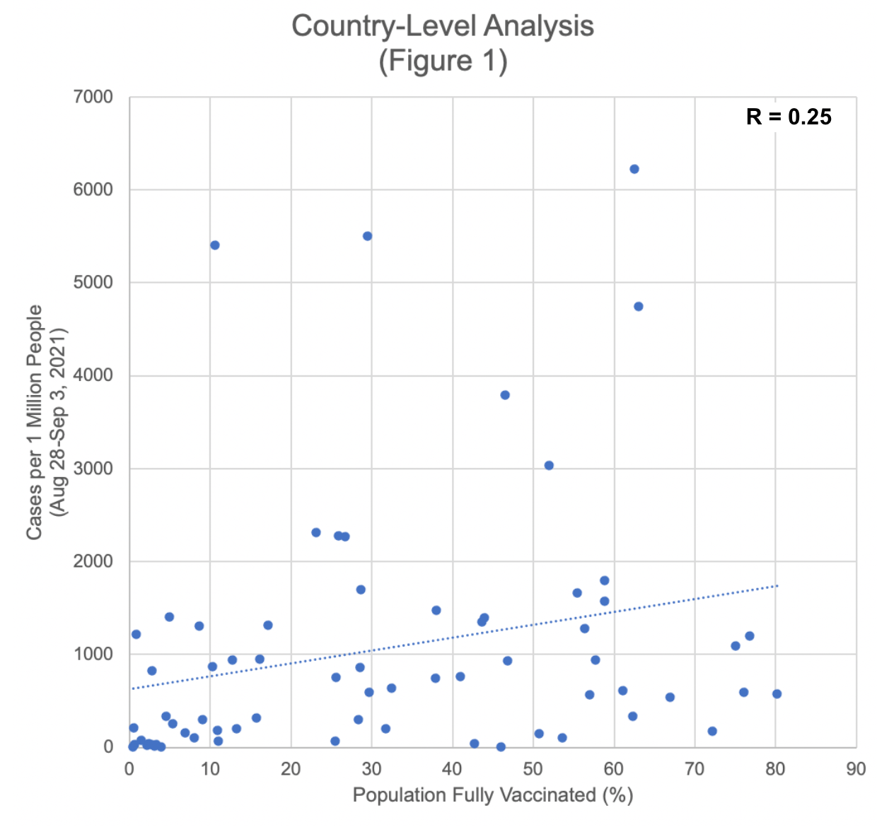
Reproduced version of Figure 1, using data from Table S1. Correlation analysis done by me (R = 0.25, p = 0.04.)
This analysis is so bad I’m shocked it got published. Here’s why.
First, they picked an essentially random week and calculated the correlation between vaccination rate and COVID-19 cases per million for only that week (the 7 days preceding September 3, 2021, presumably the date the analysis was done). Given that the pandemic ebbs and flows at different times in different places around the world, doing an analysis that looks at only one week isn’t particularly helpful or reliable.
But that isn’t even the biggest issue. The main issue here is that these results are highly influenced by confounding. Confounding occurs when there appears to be a relationship (or lack of relationship) between two variables of interest (in this case, COVID cases per million and vaccination rate), but both of these variables are actually influenced by a third variable, which in turn influences the results we see. And what is that confounding variable in this case? Wealth.
Richer countries have more capacity to vaccinate their citizens (so have, on average, higher vaccination rates), and also have higher capacity to test for COVID (so have, on average, higher recorded COVID case counts.) We can easily see this in the data if we add in a third variable for GDP.
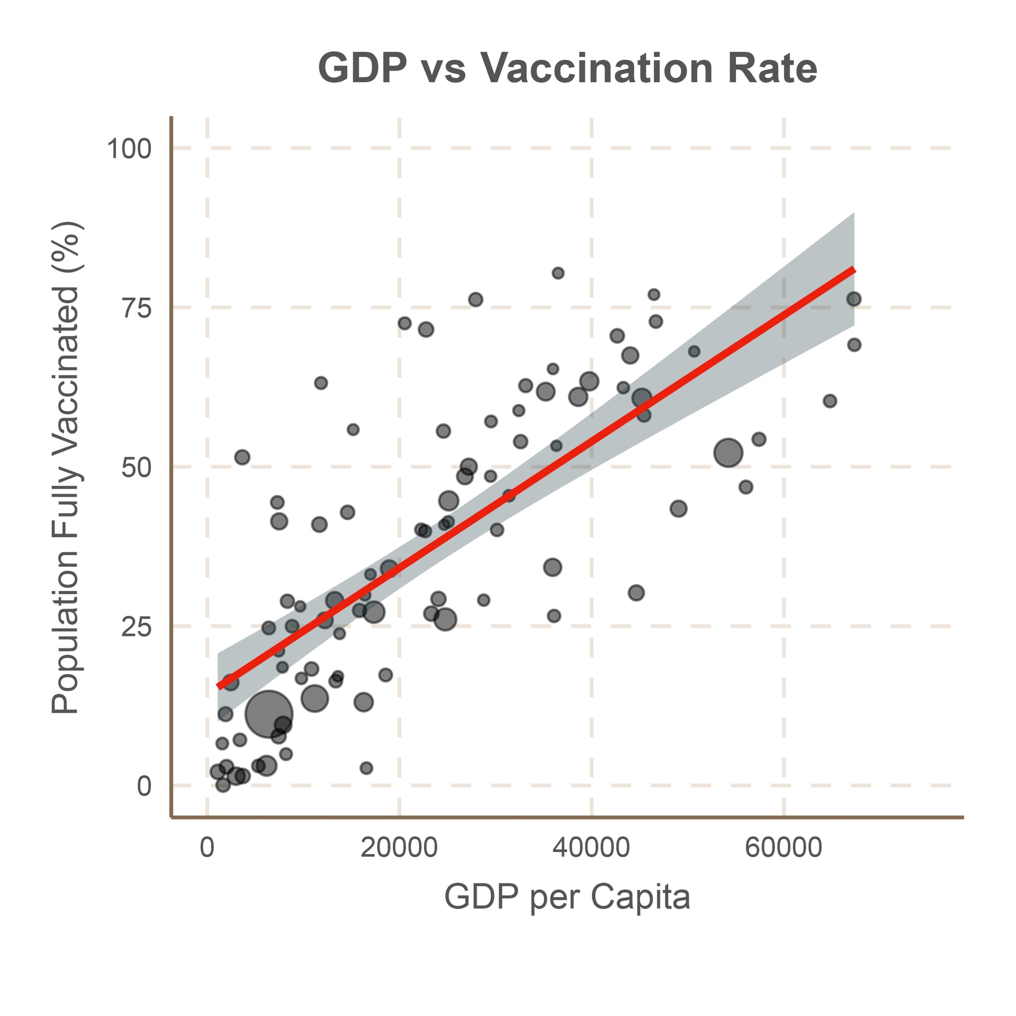
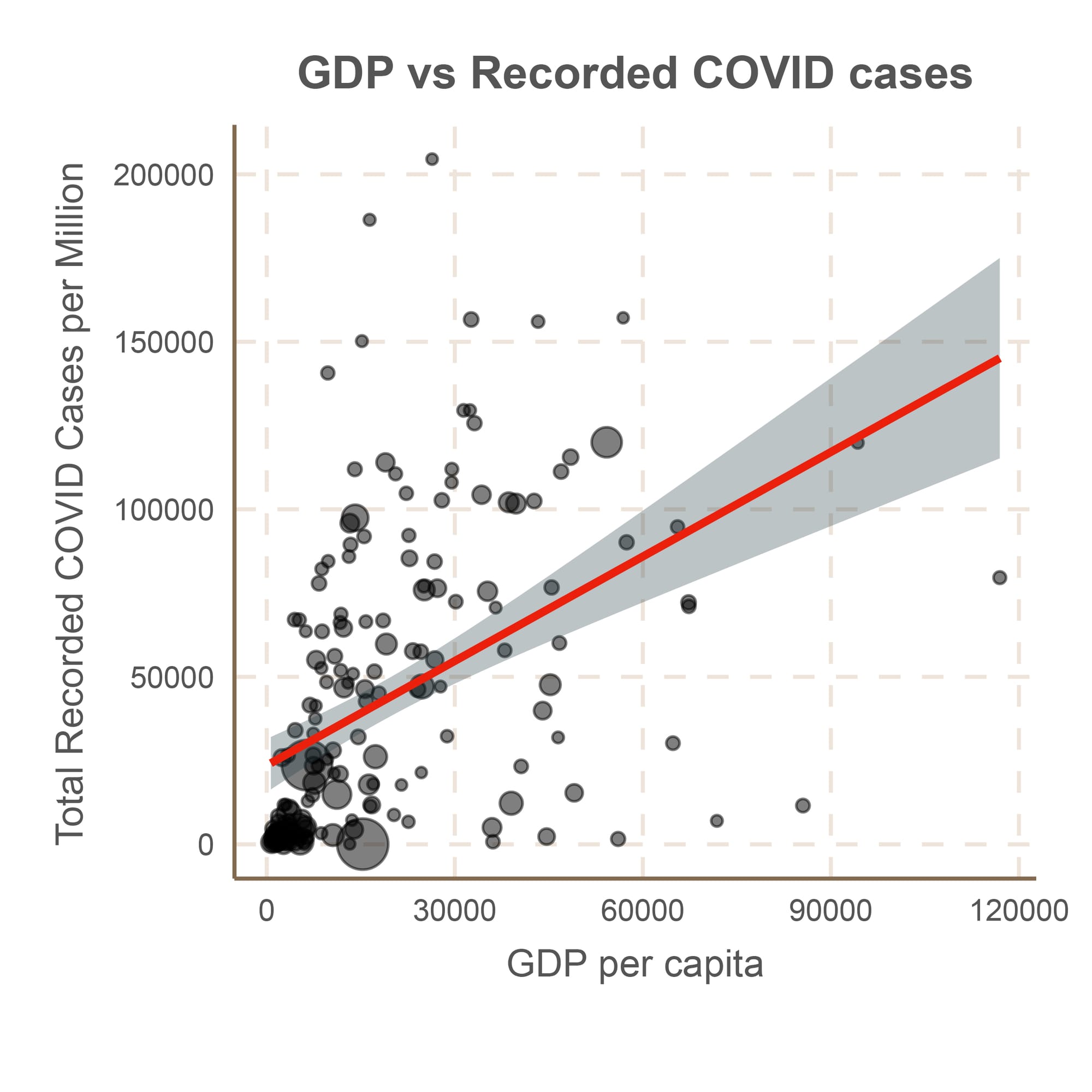
Correlation between country-level GDP per capita and COVID vaccination rate on September 3, 2021 (left, R = 0.74, p < 0.0001) and total recorded COVID cases per million as of September 3, 2021 (right, R = 0.45, p < 0.0001). Size of points corresponds to country population. Data source: Our World in Data.
Do poorer countries actually have less COVID? Of course not. Both providing vaccinations and detecting and reporting COVID cases takes infrastructure, which requires money. So the fact that poorer countries with lower vaccination rates also have lower recorded COVID cases does not mean that vaccines don’t work, nor does it mean that these countries have been spared from the pandemic. It means that the wealth of a country influences a whole lot of different things about that country, including their ability to track a pandemic, and this variable must be accounted for if you want to do an analysis comparing 68 different countries.
In conclusion, this analysis is deeply flawed, and should never have been published.
A lesson in moving the goal posts: county-level analysis
Alright, now their second analysis. They look at vaccination rates and COVID cases in US counties. But instead of doing a simple correlation like they do for their first analysis, they add some twists.
Before we go any further, let’s see what happens if we do run the same type of analysis they used for the country-level data. Here is what we find:
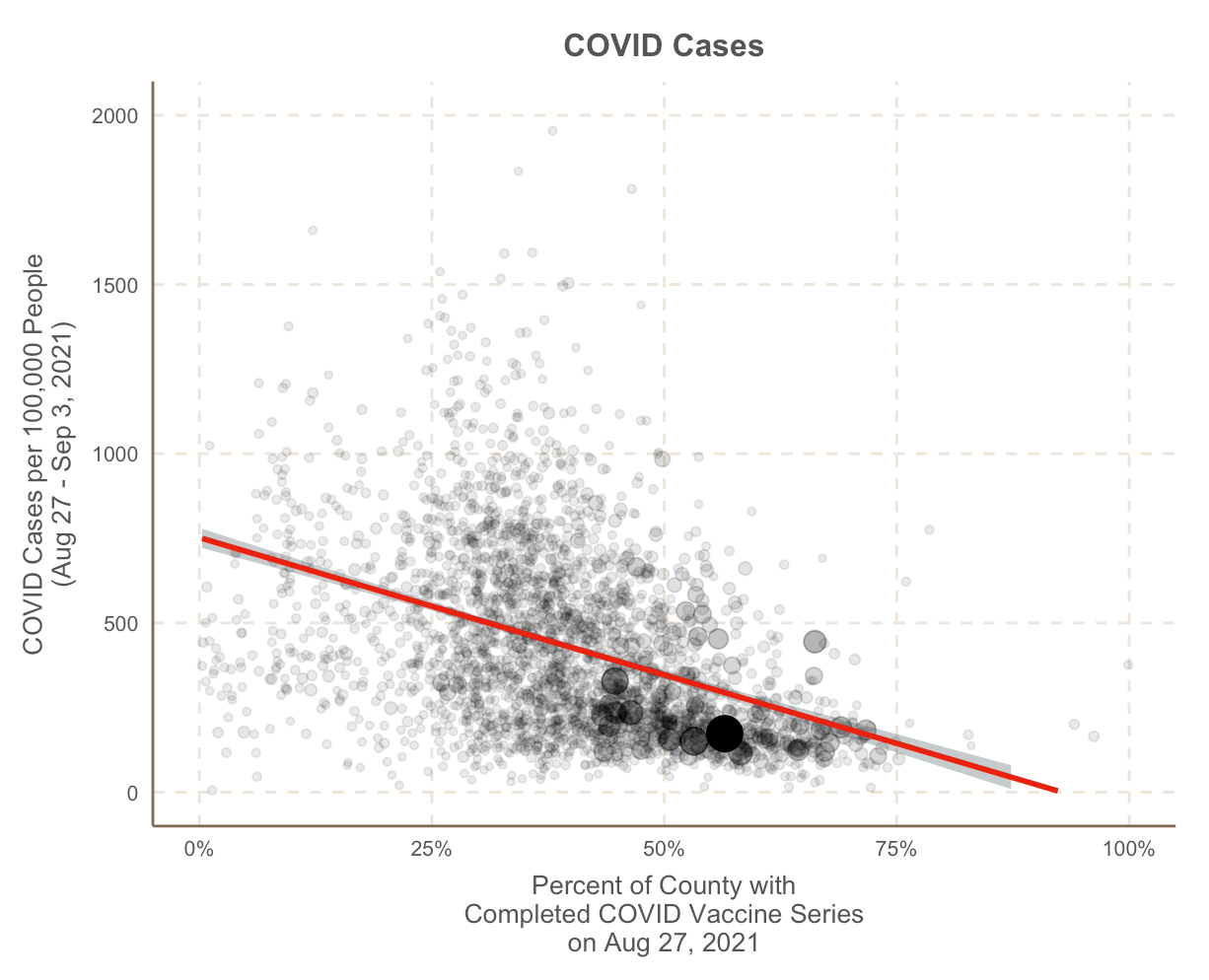
Correlation between county-level vaccination rate on Aug 27, 2021 and COVID cases per 100,000 during week preceding Sep 3, 2021 (R = -0.38, p-value < 0.00001). Analysis by me, data source for vaccinations: CDC, COVID cases: Johns Hopkins Database. To exclude counties with delayed/insufficient reporting, I included counties with at least one completed vaccination reported (vaccination rate > 0%) and at least one COVID case reported. One outlier removed for visualization purposes (Hot Springs, Wyoming: vax rate 38.5%, 4,500 cases per 100,000 people.)
There is clearly a correlation between higher vaccination rates and lower COVID cases across US counties, even when only looking at that random week preceding September 3, 2021. If they had simply repeated the analysis they had done for the 68 countries and run any statistics, they would have discovered this.
So what does the paper do? Instead, it breaks up US counties by their vaccination rate (0-5%, 5-10%, etc.) and plots the median number of COVID cases per 100,000 people for each group (Figure 2). Despite not running any statistics, it concludes “the median new COVID-19 cases per 100,000 people in the last 7 days is largely similar across the categories of percent population fully vaccinated (Fig. 2).” However, their figure clearly shows that with the exception of the 0-5% vaccinated group (which may simply reflect poor data collection and reporting in those counties), higher vaccination rates are associated with lower median COVID cases. We have already shown this to be the case in the analysis above.
Next, they switch it up even more (Figure 3). Instead of looking at the number of COVID cases per capita in a given week, they look at the change in COVID cases compared to the previous week. They then calculate the percent of counties for which the change was positive (cases were increasing) across the different vaccination groups. They don’t take into account how much the cases changed or how many cases there were total, only whether or not the cases were going up.
They conclude that there “appears to be no significant signaling of COVID-19 cases decreasing with higher percentages of population fully vaccinated (Fig. 3).” The results they found, said simply, were that COVID cases were increasing nearly everywhere, regardless of vaccination status.
There are a whole bunch of things wrong with this analysis. If you feel confused by the paragraphs above, I don’t blame you, because it’s a very odd and convoluted way to analyze the data. But I will do my best to demystify it.
First, what was happening in the US around the end of August 2021, the period used for this analysis? Nationally, it was the peak in the delta surge. Delta peaked in different regions of the US at slightly different times, but at the end of August and beginning of September when this analysis was done, COVID was increasing all over the country.
What does this tell us about vaccines? Was the fact that cases were increasing in areas with high vaccination rates and low vaccination rates alike mean that vaccines don’t work?
No. Remember, this analysis counted a county as “increasing” if the cases were increasing at all. The county could have had very low rates of COVID overall, and increased from only 5 to 10 cases per week, and it would have been counted as “increasing.” A second county that increased from 1,000 to 10,000 cases per week would also be counted as “increasing.” Based on the way they did their analysis, there would be no way to distinguish these two counties, even though they clearly are very different scenarios. Both are treated identically.
Without taking into account how fast cases were increasing and how many cases there were in total, it’s difficult to conclude much of anything about how vaccines were impacting COVID dynamics. No one was expecting that a 60% vaccination rate would mean that COVID cases would never increase at all, ever again.
Is there a correlation between vaccination rate and the number of COVID cases?
The analyses presented in this paper are very flawed, and don’t tell us much of anything about the relationship between vaccination rates and the spread of COVID. So now, let’s do a little analysis of our own to see if there is a correlation. Instead of looking at a random week, let’s look at the entire delta surge as a whole in the US. If we look at the vaccination rate on July 1, 2021 (roughly when the US delta surge started) and compare it to COVID cases (and deaths) per capita throughout the entire summer (Jul 1 – Sep 30, 2021), this is what we see.
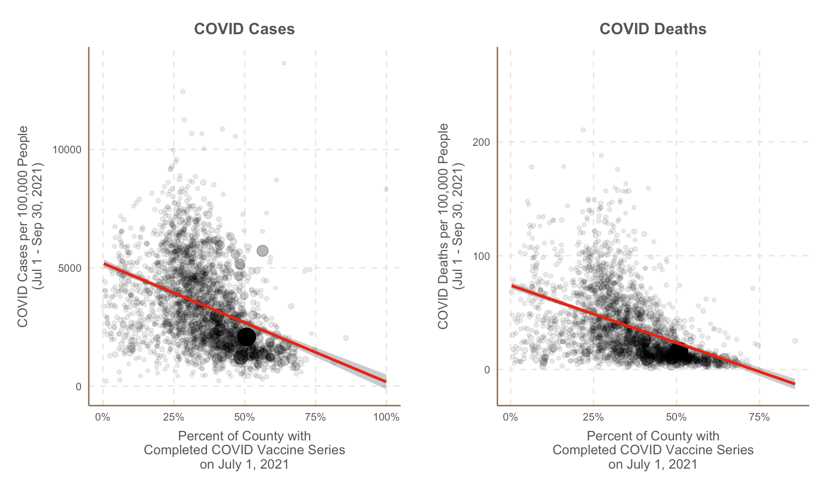
Correlation between US county-level vaccination rate on July 1, 2021 and county-level COVID cases (left, R = -0.36 , p < 0.00001) and deaths (right, R = -0.42, p < 0.00001) per 100,000 people during summer 2021 (July 1 – Sep 30, 2021). To exclude counties with delayed/insufficient reporting, this analysis includes all counties with at least one completed vaccination reported (vaccination rate > 0%) and at least one COVID case or death reported, respectively.
There is a very clear correlation between county-level vaccination rate and COVID cases and deaths per capita. Where there are more vaccinated people, there is less COVID. If you are not used to looking at population-level correlations which often have quite a bit of noise in them,* perhaps this view of the same data will make it a little bit easier to understand.
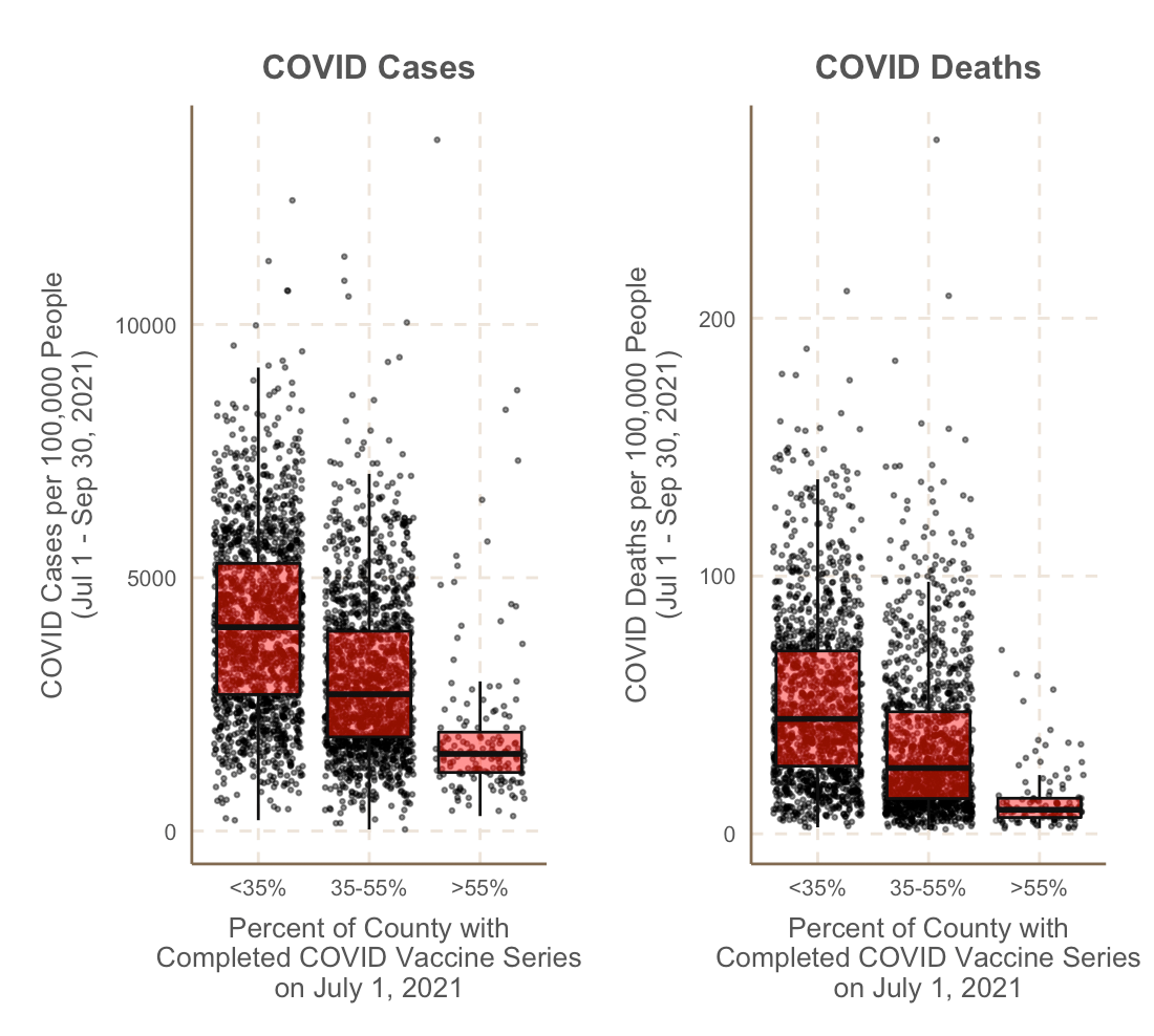
*Nobody expects a perfect correlation between vaccination rate and COVID cases/death as we know that other factors will influence COVID dynamics including population density, social distancing, etc.
In summary, contrary to the conclusions of this paper, there is a very clear correlation between US county vaccination rate and COVID cases this past summer. This paper was horribly done for many reasons: convoluted analyses, choice of a random week for analysis, no consideration for basic confounders, no statistical tests, etc. It should never be cited again.

